Bridge
Bridge (Made-up name due to privacy) is an IOS travel app that I designed in March, 2019. This app is for people who like to travel but focus on local culture exploration. It was supposed to be launched in Fall, 2019.
Final Prototype:Bridge on invision
Project Summary
Role: UX/UI Designer (40% UX, 60% UI)
Time: March 2019 . Tools: Sketch, Pen & Paper, Invision, Photoshop
Customer: NDA customer.
Goal: Design a travel app that focus on local culture exploration based on client’s initial concept for IOS devices.
Background: The project was handed to me with some basic low-fidelity wireframes from the client , who also described the features and the purpose of the app, meanwhile specifying that they are looking for a “clean and modern” look.
Problem: For people who believe that embracing different cultures will richen their travel experience, the information is overwhelming nowadays. There are so many travel sites out there but there’s barely one focus on local culture exploration.
Solution: Design an app that is building a bridge between two different culture. Users can read and save different guides (focused on culture) of different countries with offline access. Users can also contribute their cultural experiences to the built-in forum and communicate with other travelers.
Approach
Since I already had a list of what features the client (stakeholder)is expecting and a few hand-drawing wireframe screens, I was mainly focus on building wireframes and visual design. However, in order to ensure the product is user-center designed, I also decided to analyze the project and to see how to make it meet user’s need better. So I started the process with understanding users.
Step 1: Analyze
Understand the Goal
Interview the stakeholder/client:
What’s the goal of this app?
why do you want to build this app?
From communicating with the client, I learned that she is passionate about traveling herself and has been doing volunteer job abroad in third world countries. She usually takes longer trips abroad and her purpose of traveling is to explore the local culture instead of hanging in a resort. However, it is really difficult for her to find cultural related travel information from all these travel websites, her only method is through google and the information is all over the place.
Main Goal of this app:
When a user (Sarah, I use Sarah as my user) travels to a new country (no matter for leisure or business), she can easily pull out the app and find about cultural related information and gets to understand local culture better and enjoy her trip without spending time googling. If there’s no related information listed, she can go to the built-in forum to look for answers and discuss with other travelers.
2. Understand the User
Who are the users?
People who travel and are interested in exploring local culture.
How users might feel at the specific point of time when they want to use this app?
When users are prepare to travel abroad for business or leisure, they are:
— not sure what to pack/wear for difference occasions
— confused about what local manners are
— it takes so much time to put everything together (take pictures, take notes, write down)
— it’s tedious to find related information on the internet
When users are traveling, they:
—have to keep going through the information they brought and find the one they need
Users’ pain points:
— going through the whole internet to search for specific cultural related information
— put all travel information together and go through them when needed
Based on Sarah’s goals and needs, and combining with the features the clients wants, the app should have below features:
Countries guides. Each guide has different sections & tips covering the some basic and cultural information of this country.
Users can save the tips and the country’s guide.
A forum for users to discuss and communicate.
User profile for users to access the guide they saved and read the information they saved.
From client’s business perspective, there are two features must be included as well:
Users need to purchase premium tips - or purchase a whole guide.
Purchase different templates for users to use when read the tips they save.
Micro Goals & Tasks breakdown: (Goals of the users and user tasks)
Goals: ( listed by priorities)
Read the information of a specific country
Save some useful information and users can read it anytime
Go to the forum to ask questions or find answers
Tasks :
Search & find a country
Read the information under the country and save the ones which are useful
Access the travel information which are saved
Read and contribute to the forum of a specific country
User stories:
When I plan for a trip, I want to find related travel information quickly and easily, so I can save time and pack right
When I’m in a foreign country, I want to access to the travel tips I have saved previously anytime so I know how to behave and what to wear for a specific occasion.
Storyboard:
I walked through the journey of how Sarah uses the app before, during and after her trip. It helps me with the empathy for Sarah and understand the contexts from users’ perspective,

Constraints :
Limit the countries to a specific amount (popular ones first) so it’s easier to built the data and also more usable for users.
App specific requirements:
— Offline access: Users need to use the app abroad, they should be able to access the information anywhere and anytime when there’s no internet connection.
— Log in and Sign up: Since users need to post in forum and save the country guide, users need to create a profile to access their own information.
Step 2: Information Architecture
User tasks and User flow diagram
I went through low-fidelity wireframes provided by the client, combining what the features this product will have based on my analysis, I listed main user tasks and came up with user flow diagrams accordingly to understand how people will interact with this app when they need to complete an action, and this also helped me understand if any problems will occure when completing the task.
Task 1: Log in/ Sign up
Task2: Read a guide
Task3: Save a tip
Task 4: Access Forum
Task 5: Go to the my profile and see my activities
Task 6: Read the tips I saved
Task 7: Purchase the premium tip or guide
Task 8: Purchase different template when reading the tips (The template makes the tips display nicer and more fun)
Information regrouping and Sitemapping
The main structure of the app appeared clear after user flows diagram. So far it included all features that the client required. But before finalizing the sitemap, I would also consider from users’ perspective. I found that Forum can be an individual tab which can be accessed directly from the menu while also accessible when users get to the country guide. I also want to make the search bar visible on top of main screens so it’s easier for users to find information.
Step 3: Mid-Fidelity wireframes
Based on the provided low-fidelity wireframes from the clien & information I have gathered, I sketched out the wireframes.


Step 4: Visual Design and Refining

I gave different color combinations for clients to choose from. The theme color is too bright to match with other colors with bright hues. I kept the rest of the colors a white/black/grey scale, while added a little purple/orange accent for a dynamic look.
The client has a website set up already introducing this app, the theme color they used is aqua blue (hex#33D1B6) so I kept the same color for the app. Clients also want to use Open Sans as the fonts of the app.
During this stage, client handed over the full content to me, and we discussed what can be improved. I re-picked some images to use, since this is an app exploring culture, I avoided images of beaches and palm tress (they give users a more leisure/vacation impression). I adjusted the first a few screens, to make them as clean& consistent as possible.
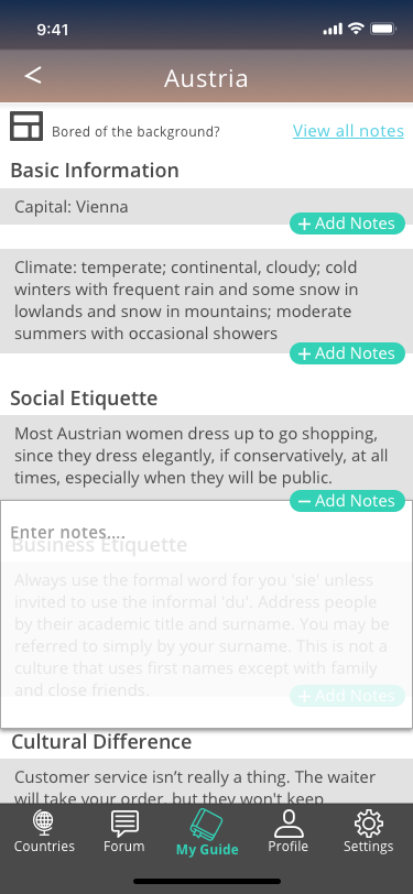
When going through the high-fidelity prototype on invision, we also decided to add a couple of new functions like “user’s badges” (on profile screen) and “add notes“ (on saved tips), they can encourage users to contribute their advice and to be better prepared for the trip.