Health E Livin (Mental Health Screening)
Health E Livin is a black female owned organization that focus on mental health management. It provides mental health screening and mental health resources. I redesigned their app for both iOS and Android in the spring of 2021. Currently the app is being built and I’m going through design reviews for each screens.
Project Summary
Problem:
1. People might experience mental issues but never be able to recognize them. 2. There are many mental health providers but people have no idea where to seek for help that match their needs. 3. Existing app cannot keep users.
Solution:
Re-define the goal of the app to match the needs for both users and the business. Simplify the user flows, interface and improve the user experience.
Helpful resource: Health E Livin Org.
Role: UX/UI Designer (50% UX, 50% UI)
Time: March, 2021 - May,2021
Team: Lajewel Harrison - Business owner
Tools: Figma
Background:
The mental health is always an essential topic for millions of people especially during the pandemic. This app gives an opportunity for everyone to anonymously assess their mental health at their finger tips.
Design process overview
1: Understand the product and review the main flow for current app
I went over the current screenshots of the app and tried to understand the structure of the app:
Three main features -
Search for a mental health facility
Mental health screening
Mental health resources (articles etc.)


2: Redefine the goal of the app and problem-shooting for current app
I realized the current app doesn’t have a clear goal and the navigation is very confusing.
I consolidated two possible goals that this app is showcasing and spoke with LaJewel (business owner) for clarification. Besides having a clear and easy to use app interface, i also want to understand what is the business goal behind the app. So I can balance the needs between users and business.
V1:
V2:
3. Balance the needs between Business and users, Find solutions & Craft new Features
During the meeting with LaJewel, she told me that the only way for the business to make profit is to lead users to the mental facility. So from the business perspective, she would love to have the “search for providers” feature as the prominent feature. She also shared their official website to give me a better idea on their mission and value.
Based on different users mental situation, all other features like resource & screening are playing a supporting role.
4. User flow & Mid-fi wireframing
Wireframed the main user flows based on the navigation and new features.
Designs are slightly different for users who have account/ without an account to help registered users track their health and keep using this app.

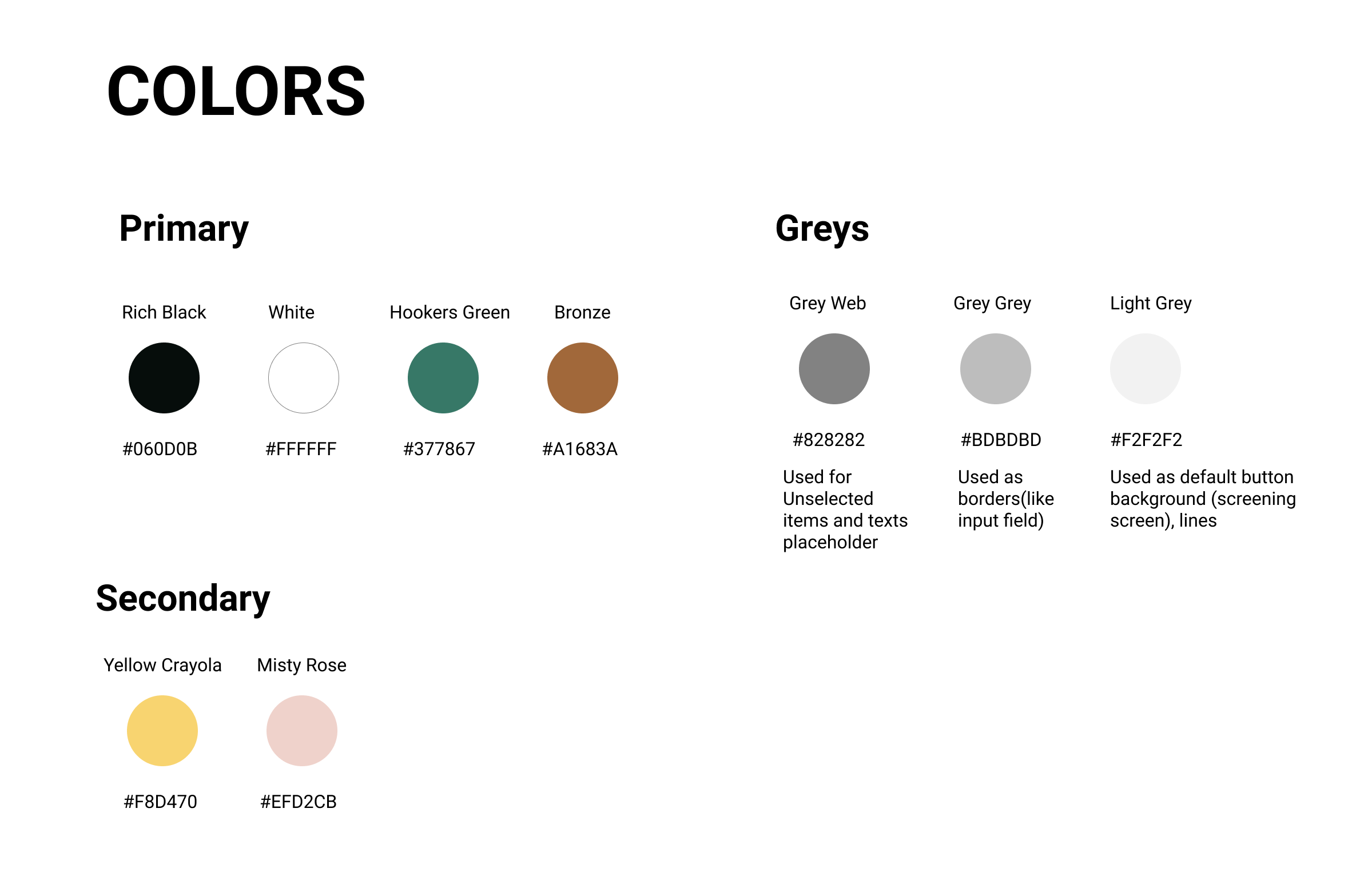
4. Theme color exploration & Branding
Created a moodboard and put up other mental health service examples to find a good sets of color pallets for the visual look. LaJewel is ok to either stick with the current brand or a more creative look. And eventually we decided on a similar color palette matching current brand but in warmer tone.


5. Hi-fi wireframes
Challenge highlights
Challenge 1:
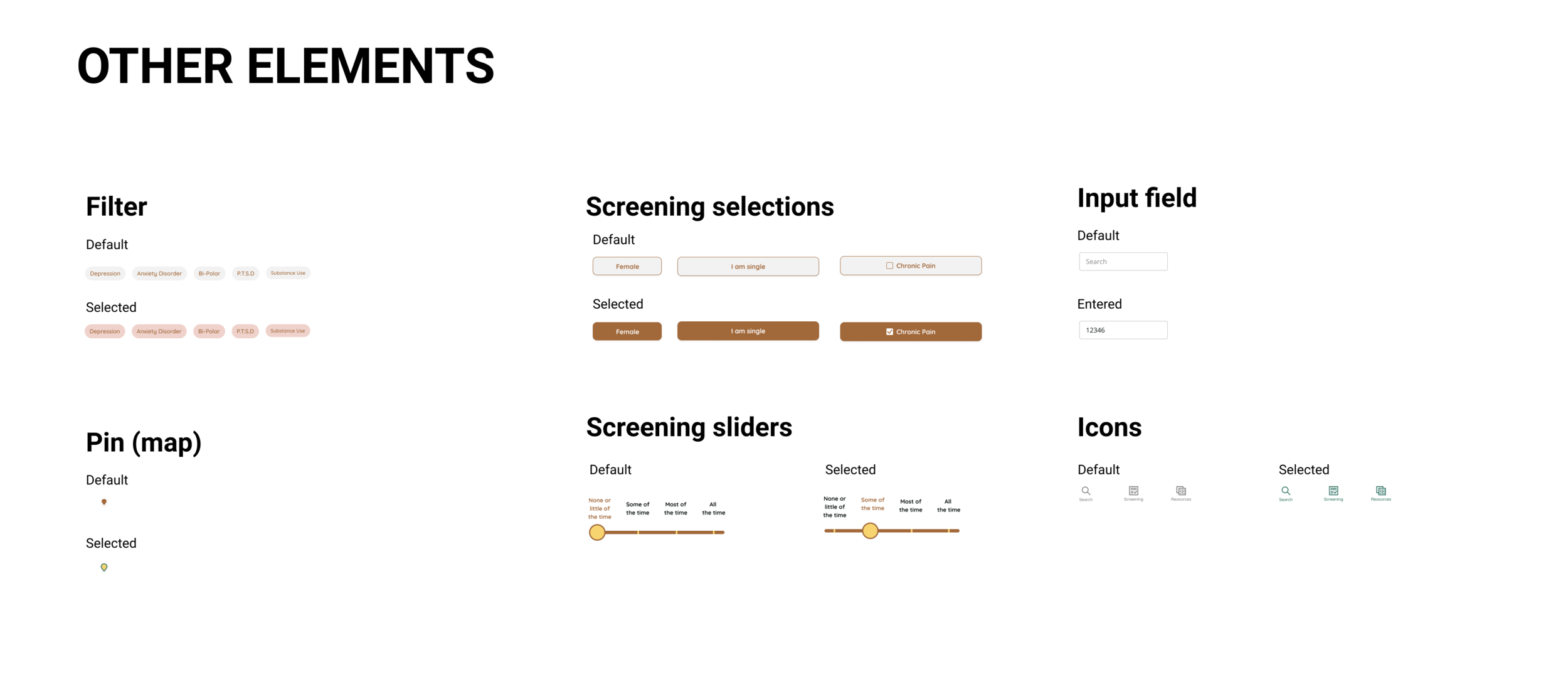
The biggest challenge for hi-fi wireframes is the visual translation of the screening questions & screening results.
Basic questions have single select and multi select; while for screening there are “yes and now” and “how often”questions. And for screening results, they are indicated by numbers and chart on the instruction which makes it hard to users to understand if just read it as is.
Challenge 2:
Only 2 screenings are a “must take”, one is basic information and the other is the Depression screening. So I had to design a progress indicator screen in between screening to make users understand better which test is optional and how to reach their health result.
When users finish the Depression screening, the CTA button automatically changed to “Continue to result” - it gives users the option to skip other screenings. While all other screening are becoming tappable links, and users can also choose “start“ to take any test they want.
Other main screens
6. Prototyping & Handoff on Figma along with design guide