Ink Tank
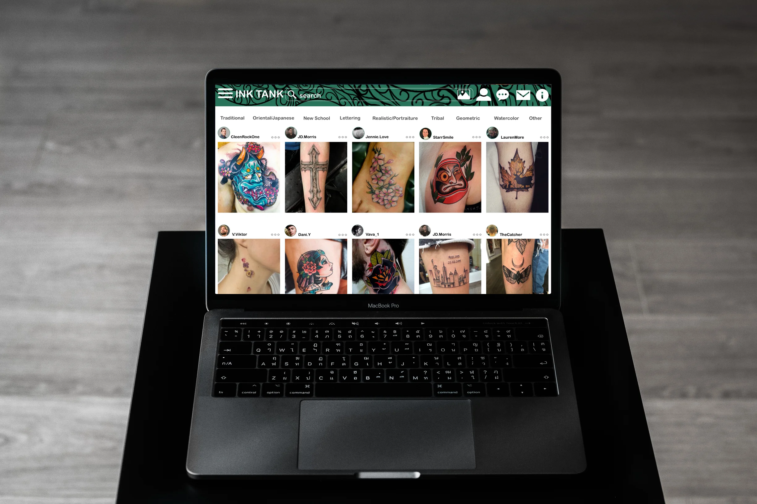
Ink Tank is a product I've been working on since March 2018. The goal of this product is to explore inspiration for tattoo designs and to communicate directly with tattoo artists.
Final prototype: Ink Tank on Invision
Project Summary
Role: UX/UI Designer (70% UX, 30% UI)
Time: March 2018 - August 2018
Tools: Pen&paper, Google drawings, Balsamiq, Sketch, Invision, Keynote
Goal: To create a platform for people who to explore inspiration for tattoo designs and to communicate directly with tattoo artists, so that they will find the tattoos they want and reduce the regret after getting tattoos inked.
Problem: People thinking about getting a tattoo already have an idea in their minds about what they want the tattoo to look like. However, it’s difficult to build upon a concept without knowing who to consult or where to find a reliable tattoo artist. Word-of-mouth is usually the first step to finding a tattoo artist, but that doesn’t eliminate the risk of meeting a tattoo artist who doesn’t understand one’s needs or aesthetic to create a design for an intended body part.
Solution: A mobile and web app that allows people to share and upload their tattoo concepts and art freely. Tattoo artists will upload profiles to share their work so that prospective clients can speak with the artists directly about their ideal designs. Tattoos will be displayed by artist and by style. People are also able to locate tattoo studios nearby and attend tattoo-related events.
Methodology:
I approached the Design Thinking Process for this project. Design Thinking is a solution-focused method, it’s all about dreaming big and imagining what could be, then transforming these dreams into technologically feasible solutions. Firstly , I started with understanding the problem, performed user research in order to observe your potential users and determine their needs and goals. Secondly, I created user personas - looking at things from users’ perspective and then made ideas from them. Thirdly, I built wireframe after wireframe, and then turned them into interactive prototypes. In the end, I did usability testing to gain user feedback and iterate the process to make the product better. Visuals designs also applied in the product after usability testing, and I created a video and Invision prototype to present my final project.
Approach:
Understanding the Users
Creating User Stories: User stories provide an excellent way to define Ink Tank with clarity, and helps me define “ what matters the most to users.“
1. As a person who wants to have a tattoo but not sure what to get, I want to look at all kinds of tattoo designs, so that I can get inspired and decide what my next tattoo will be.
2. As a person who wants to have a specific tattoo style, I want to filter the images by tattoo style, so that I can see all the designs under this style and find the one I like.
3. As a person who wants to have a tattoo, I want to easily save the image, so that I can always see what are the images I’m interested in, which will be helpful for me to made my find mind of what tattoo to get.
2. Performing User interview:
Tattoo artist and Potential clients & Data sorting: Affinity Map
Ink Tank's target audience can be divided into two groups: Tattoo artists and potential clients. Three people from each group were picked for user interviews. After the interview, I used affinity map as my analysis method to sort and group the data.
4. As a tattoo artist, I want to share the designs I’m capable of with potential customers who have a similar ideas, so that I can get more business.
5.As a person who wants to have a specific tattoo, I want to search the specific word of the tattoo directly on the search bar, so that I can easily get the tattoo design ideas and make up my mind.
6.As a tattoo artist, I want to upload my own design work, so that I can inspire others while also attract potential customers.
7. As a Tattoo Artist, I want to receive immediate notification of other people’s reaction to my designs, so that I can view the feedbacks and improve my designs and business.
Tattoo artist 1
Potential client 1
Tattoo artist 2
Potential client 2
Potential client 3
Tattoo artist 3
As a result of affinity mapping, I gained important insight below:
- Users can filter the search results by color and style.
- Users can input any keyword in the search bar for a specific search, like tattoo content and artist.
- Ink Tank can feature tattoo events nearby to help expand the network of the artist
- Ink tank should enable direct messages and comments for customers to send inquires and communicate with artists directly.
- Ink Tank should have functions to protect a tattoo artist’s copyrights.
- When featuring tattoo artists, Ink tank can also list their tattoo shops.
3. Curating User Persona: Freddie and Dominick
Based on the user research, two personas were developed. Freddie represents the tattoo seeker while Dominick is a tattoo artist. Their thoughts and needs helped with the main decisions during the whole design process.
Freddie is obsessed with tattoo art and always wants more. He wants to browse tattoo art whenever he has a chance and get to know more artists. Due to a limited budget, he doesn't want any regrets when investing in new ink.
Dominick is a young tattoo artist with a lot of creative ideas, but he needs to find a platform to expose his work to more people. He wants to make unique art but doesn't want other artists to steal his ideas. He is active on social media to attract customers.
4. User Journey Maps & User flows
Three journey maps and user flows were created based on the needs of the personas.
User flow 1:
Search an ideal tattoo by keyword and save the tattoo image to an artboard.
User flow 2:
Browse saved tattoo images from an artboard, check artists' profile and message a tattoo artist directly.
User Flow 3:
Upload an image from a phone and save the image to an existing or a new artboard.
Information Architecture
Sitemap & Card sorting
I did Open Card sorting via Optimalsort: 30 cards were created, and 7 people completed the card sorting. By analyzing and comparing the data, I created the final sitemap and obtained a brief idea of the structure of the app.
Wireframing & Prototyping
By looking at all the information I’ve collected, I focused on three core features and created wireframes and prototypes from low-fidelity to high-fidelity, at this stage, I only used black/grey as the main colors.
Low-fidelity wireframes & prototyping
Tools: Paper and Pens
Mid-fidelity wireframes & prototyping
Tool:Balsamiq
High-fidelity wireframes & prototyping
Tool: Sketch
Usability Testing
Moderate in-person and unmoderated remote methods.
Six people were participated in the test. Some of them already have tattoos, some of them are interested in having tattoos. My goal was to observe and measure if users understand the project, how easy for users to navigate, and if users are able to complete the tasks during the test.
Time: June 22- June 29 . Location: New York City
Task Objectives:
Find out if participant can easily locate the search bar to search for their ideal tattoos
See if participants understand the navigation and access to the user profile
Check if participants have difficulties in saving an image to an artboard
Check if participants are able to check artist’s profile and message the artist
Find out if participants like the layout of the design
What are the most common errors users make when completing the tasks
2. Conduct test result: Affinity Map & Rainbow spread sheet
Test Report:
Issue 1: Uses have difficulties in saving an image. (High)
5 out of 6 participants have problems of find the “save” button, they are not sure which button means save, and where it is actually located.
Issue 2: Uses cannot recognizing the filter button (High)
4 out of 6 participants don’t know where the filter button is, and 2 of them suggested the filter button should be discarded because users can type everything on the search bar.
Issue 3: Uses are confused about the functions on the Artist profile page (High)
All participant had no problem clicking the message button to message the artist, but they were all confused what are other icons mean.
Issue 4: Uses are not sure where to add the description for the uploaded image (Medium)
5 out of 6 participants hesitated where to add the description for the images they uploaded, they had no idea where to click but asked the question.
Issue 5: Uses are not sure if the new artboard is successfully created (Low)
Only 1 out of 6 participant pointed out and was not sure the artboard was created successfully and thought she missed a step. But 2 other participants asked “that’s it right?”
UI Design and Iteration
Design Language
I made revision to the prototype based on user feedback meanwhile started working on the User Interaction design. For colors I decided to use dark green color as the main color because it is the traditional tattoo ink color. For the background of the app, I decide to keep it white so there will be more color contrast.


2. Designing for Human
All products should be user friendly. By following the IOS Human Interface Guideline and considering people with different accessibility, I did a few adjustment on the details so it will be easier to use, for example below:
Search Bar:
-Enable the clear button to clear the texts & Provide hints and contexts in the search bar
Navigation Bar:
- Place texts beneath the icons.
Color:
-Avoid using the same color for interactive and non-interactive elements.
3. Iteration and Refining
I reached out to people online and received some new feedback. Design a process of iteration. I analyzed the feedback and took some useful ons and refined the design. Most of the feedback is the readability: enlarge the texts, adjust the image color so users can read better.
Final Mockups


