Finding the Best Coverage Plan
January of 2019, I helped an insurance service company redesign their website, so that users can easily compare and choose the coverage plan that suit them the best.
Project Summary:
Role: UX/UI Designer (60% UX, 40% UI)
Time: January 2019
Tool: Sketch, Pen&Paper
Customer: NDA customer
Goal: To help customers understand the benefits from different insurance plans, and figure out the best plan for themselves.
Problem: From the UX side, the information is very unorganized and confusing. Users are not able to find the information they are looking for. From the UI side, the visual design needs to be fixed, there is no color and typography difference, it’s not visually pleasant.
Solution:
1. Create a user flow to figure out each step what users need to do to reach the final outcome.
2. Site mapping based on the user flow to see if it’s necessary to regroup the information.
3. Research the competitors’ website design.
4. Find colors, images and typography for the website.
Original Website:


Step1: Clarifying user flow

Step2: Sitemapping & information architecture

After creating user flow and sitemapping, the structure of the website is actually pretty simple, however, the information on the original website was very overwhelming regarding the 2nd use flow. All the information for users to pick are listed on the same page and its confusing. The overall visual design is also very outdated and I want to improve it as well.
Step3: Research competitor’s websites
Due to different situation and critics, insurance has a large amount of information and it’s usually difficult for users to understand and absorb. It’s important to layout the information step by step and in a hierarchy way. From competitor’s research, it’s interesting to see that most insurance companies use a big CTA button to lead users to what they want instead of losing themselves in a sea of information. And I would like to do the same and approach the same way for current website. I also like how insurance websites using real life photos showing happy individual and families, it’s very engaging and make information more trustworthy.


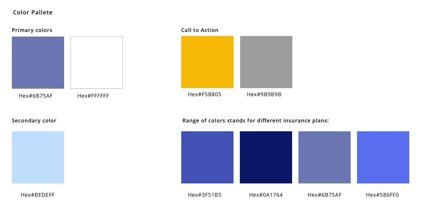
Step4: Colors, typography & images.
I choose violet & blue family because they stand for trustworthiness, security, peace and calm. As an insurance company, it’s important to win users’s trust and make them feel relaxed to choose the plan that suit them the most. I also decided to add icons stands for different categories so it makes users relate the content better. Yellow as the CTA color for alerts and it also brings the energy and cheerfulness. Since there are different groups of users so I choose different images on behalf of different groups: Eligible Employee (single), EE+1 (usually a couple), EE+Spouse+Child (a family).