Suri & Huacaya
Suri & Huacaya is an e-commerce company that sells handmade luxury goods from South America. In May of 2019, I helped them with their homepage design.
Project Summary
Problems:
Role: UX/UI Designer (50% UX, 50% UI)
Time: May, 2019
Tools: Pen and Paper, Sketch
Goal: Design a homepage and sitemap for a new brand that focus on selling handmade luxury goods(materials and accessories ) from South America.
Background: Carrying the Latin blood, the ambitious and young CEO Juan tries to break into the US market with goods from his home continent. The goods are mostly accessories and materials made by local artisans from Peru, Ecuador, Colombia. Without a store displaying virtually yet, he need to have a great website to promote his brand. He has some goods in stock, a logo and an office for photoshoot in a WeWork building in financial district.
Challenges:
There’s no enough goods in stock yet to place them online, while needs the whole site structure to be built
Not enough photos yet to be used online
Stand out from other competitors
Solutions:
Build a full sitemap for the website
Use similar and attractive free images as place holders for now
Dig into the brand’s uniqueness and stories, place it on the homepage to attract customers
Approach
It’s only a two people team in the beginning like all other startups. The kickoff meeting was short but sweet. We drew a quick timeline, and decided to focus on phase 1 & 2 first when I was there since the developer could only join later. The priority was to mockup the website, build the site structure, set up the UI elements. Then I will leave the rest back to Juan for him to proceed his business further.

Phase 1: Planning

Ideas from other E-commerce websites

Suri & Huacaya logo
Juan had a few websites he really liked and wanted to take the same approach. By researching other e-commerce sites and analyzing the audience - people with higher income that able to spend over$200 on a scarf.
current goods in stock are mostly accessories, but going forward, there will be men and women’s wear. Our audience were not able to shop them but they still need to see these information on the website.
Suri & Huacaya has already been using an established logo on the products, the website has to reflect the aesthetic behind the brand.
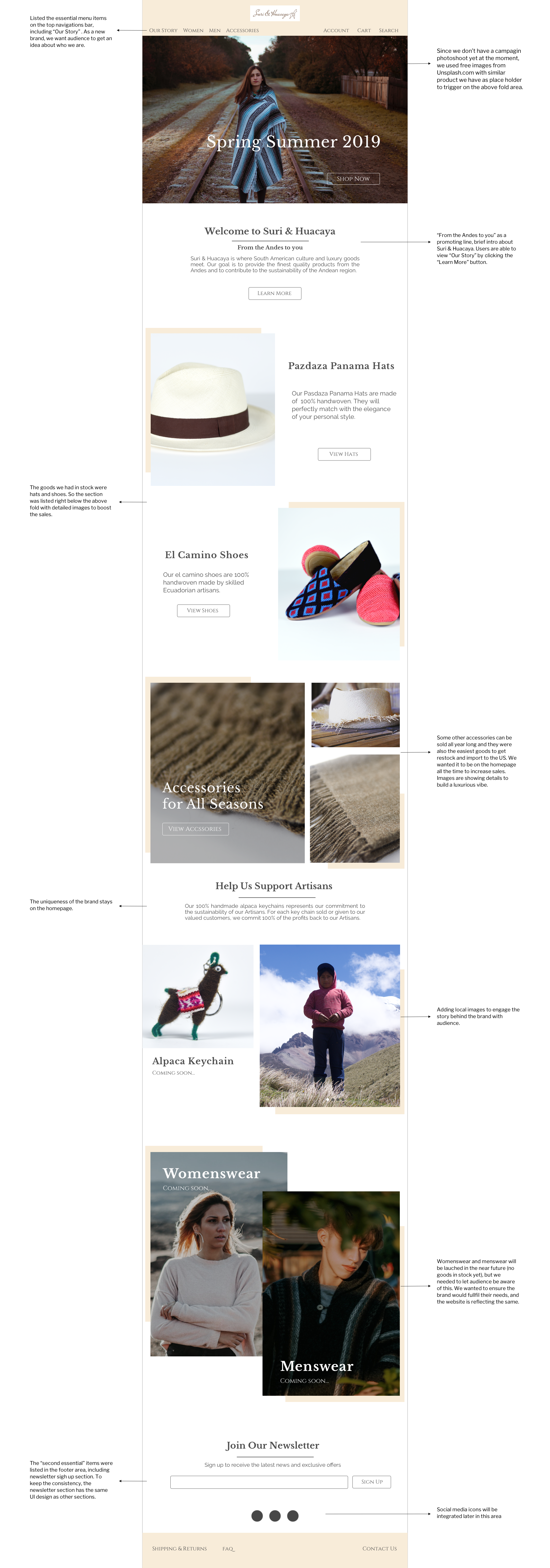
3. we want to keep everything simple, easy to navigate, easy to sign up, meanwhile everything is obvious on the homepage. Besides the basic features like other E-commerce site (like Newsletters sign up etc.) We architected the more essential content on the top navigation - including account and product information. For the footer area, listed the less essential content.
4. What’s the selling point of Suri & Huacaya? The uniqueness that other brands don’t have is that Suri & Huacaya donates a small portion of their sales back to the artisans in South American. Being a new brand to the market, we decided to talk about the brand story and its donation on the homepage to up-sell the goods.
Phase 2: Design
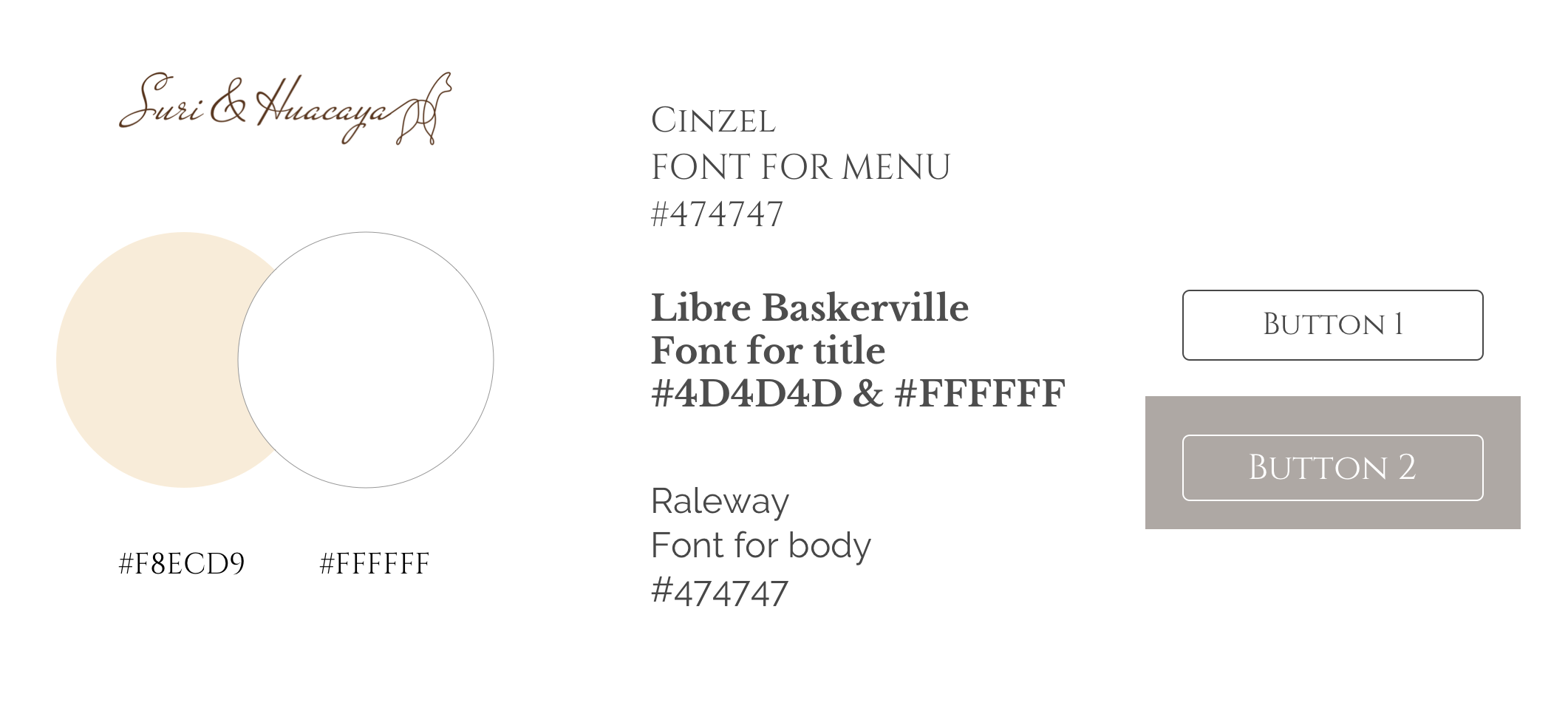
Based on the conclusion from phase 1, I finalized the UI elements. Main colors & Fonts are inspired from the existing logo. Since a lot of materials are from Alpaca, I wanted to build up the cozy feelings by using a soft tunes. Main titles are using serifs to showcase the luxurious part of the brand while body texts are using San-Serif so it’s easy for users to read through. Button corners are on the soft side as well.
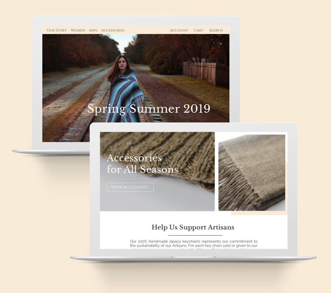
Homepage design on desktop: