Mamma Roma
Mamma Roma is an Italian restaurant located in Brooklyn. The restaurant is famous for it’s Roman style pizza. After it’s taken over by some new owners, I was asked to help them design a website in the fall of 2019.
Final prototype: Mama Roma on Invision
Project Summary
Background: A neighborhood Italian restaurant in Park Slope changed its owner. They upgraded the restaurant and needed to promote the place.
Problem: Current website is outdated; though the restaurant has a new menu and new look, customers are not aware of the new changes.
Solution: Redesign the restaurant website and coordinate it with its social media channels to attract more customer from the online platforms. Website features the menu, story, management team, events.
Role: Lead Designer (50% UX, 50% UI)
Time: October 2019 - November, 2019
Team: Sosa Domingo (Restaurant owner), Andressa Randis (Restaurant manager and owner), Andrew Holt (Restaurant owner and copywriter), Anuradha Naik (Developer)
Tools: Sketch, Pen & paper, Invision
Approach
Interviews
After receiving the invitation of designing the website, I went to the restaurant to have an initial meeting with the restaurant team to understand what they need and what they are expecting from the website to serve their current & futuree customers.
Interview with restaurant owner:
Sosa showed me around the restaurant they just took over from the last owner. It was an Italian restaurant in the beginning with an already built reputation in the neighborhood, but Sosa wants to bring it to a new level to attract more customers and even build its own local brand. He wants a website to show the quality of the place, the food and drinks in the same time. Sosa has arranged a photographer for the photoshoot while another owner Andrew would provide copy for web pages.
Communicate with the restaurant manager and chef:
The menu will be focused on Roman Pizza- which is a thin crust pizza from Rome since the Chef is from Rome himself. The Chef wants to introduce the speciality of the food on the website. Besides, there will be handpicked wines and house made cocktails. The place is spacious as well, the manager wants to make great use of the space and ensure customers are able to inquire catering on the websites.
Research the neighborhood (To Understand the customers):
The restaurant team gave me a brief introduction about the neighborhood and the history of this restaurant. The restaurant is not located on the busiest street of Park Slope but there are a lot of young couples and families live around who appreciate good food and events. The existing customers are big pizza lovers and wine enthusiasts. With a big backyard in the back, they want to bring more activities into the restaurant to attract more customers living nearby - they can bring kids, pets into the place.
2. Competitor Research
I found a few great restaurants’ websites and sent it to the restaurant team for inspiration. We highlighted below that we want to use for the Mama Roma websites:
Photo oriented , use a good amount of high quality images to show the food, space and vibe
Restaurant address, contact and delivery button (Ubereats, Seamlesss etc. ) can be placed as footer or top banner through the entire site
Use “Reservation” as the CTA on the home screen
User either Black background or White background for the website


3. Sitemapping
By gathering information from our competitors and interviews, I created the sitemap of the website. In the meantime, since Mama Roma was using square space as its hosting platform, I also checked with our developer Anu to make sure this site is doable on square space.
4. Wireframing
During the interview phase, I was told that Mamma Roma was named after an old black and white Italian Movie “Mamma Roma”. Plus, the existing logo was also Black and White. So I decided to make the colors theme reflecting the movie and used the Orange tone as a third primary color, which was taken from the movie’s original poster.
I created two versions hi-fi wireframes for the restaurant team to choose from with the actual photos they have provided. Both versions can be changed to a dark mode - black background and white texts.
Version 1:
With a welcome page to highlight the movie concept
Use image blocks as the navigation links
Below the navigation bar, the header is displayed with a long strip of image as background
Version 2:
No welcome page but directly to the website navigation and restaurant brief introduction
Use full size image in the “Above fold“ area, as the background image while also covers the entire header
Mix with light grey blocks to show the hierarchy of the site


Considering the constraints of Square Space, both versions were viewed by the team and the developer and feedback were received as below:
Version 2 is preferred but change it to dark mode
Use a full image as the home screen and minimize the navigation bar into a hamburger menu, remove the movie photo
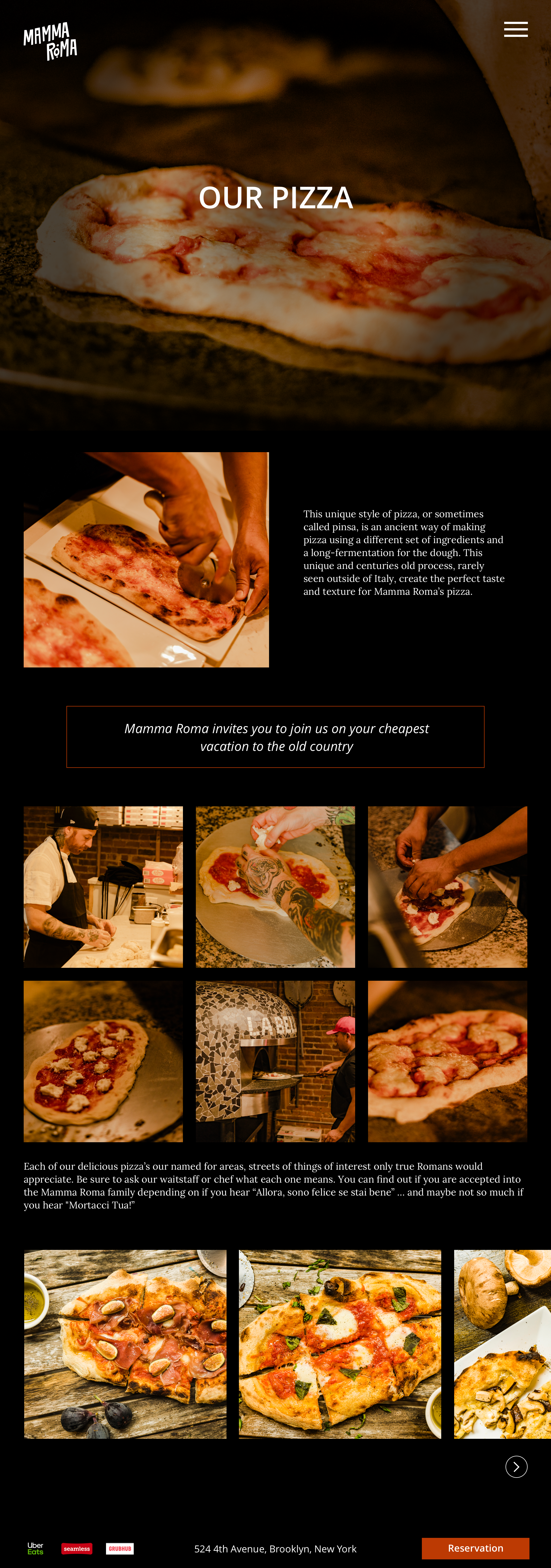
Adding more images on the “Our Pizza“ session to engage users with the “Roman Pizza“ making process
Reservation CTA button will link to its Opentable page instead, no design needed
Based on the existing Version 2, I received the copy from Andrew as well, so I switch the color and updated the designs of each page.
Final look:
5. Assets to Handoff
The finalized wireframes was uploaded to Invision and shared with developer. However, when implementing on Squarespace, we met some issues adjusting spacing and the image sizes. It’s not as neat as the original prototype but the closest we can get.
The entire Mamma Roma team was very happy and excited for their new journey. Unfortunately, due to the Pandemic, Mamma Roma’s business is closed.


