Amazing Strides
Amazing Strides is a support coordination agency located in New Jersey that helps people with with intellectual and developmental disabilities. I led the end to end redesign process for its website with my teammates at Prudential Financial in October, 2019.
Final Website:http://amazingstrides.com/
Project Summary
Background: Amazing Strides website was built on GoDaddy platform. At the moment, the only/main channel for Amazing Strides to get clients is the website. The target audience for Amazing Strides is 21+ with physical and mental disabilities.
Problem: Three main issues: Visual appearance is not attractive; information layout is not clear; and the website lacks of traffic.
Final Solution: Regroup information on the website, provide clear content to help customers find what they are looking for. Research competitors’ website and update the website with a better visual look for the website.
Role: Lead Designer (50% UX, 50% UI)
Time: October - November, 2019
Client/Customer: Dominique Anderson - CEO of Amazing Strides
Team: Nicole Adelman, Carly Kalis (Product Owner); Ira Hellman (Copywriter); Dylan Hyun, Andrew Nevado, Jorge Anunciacao (Developers); Venessa Perez (VP of the Design)
Tools: Sketch, Pen & whiteboard, Invision, Keynote
Timeline: 3 weeks
Goal: Redesign Amazing Strides website to attract more clients and introduce its service to more people.
Approach
We only had 3 weeks time for us to finish this project from the beginning.
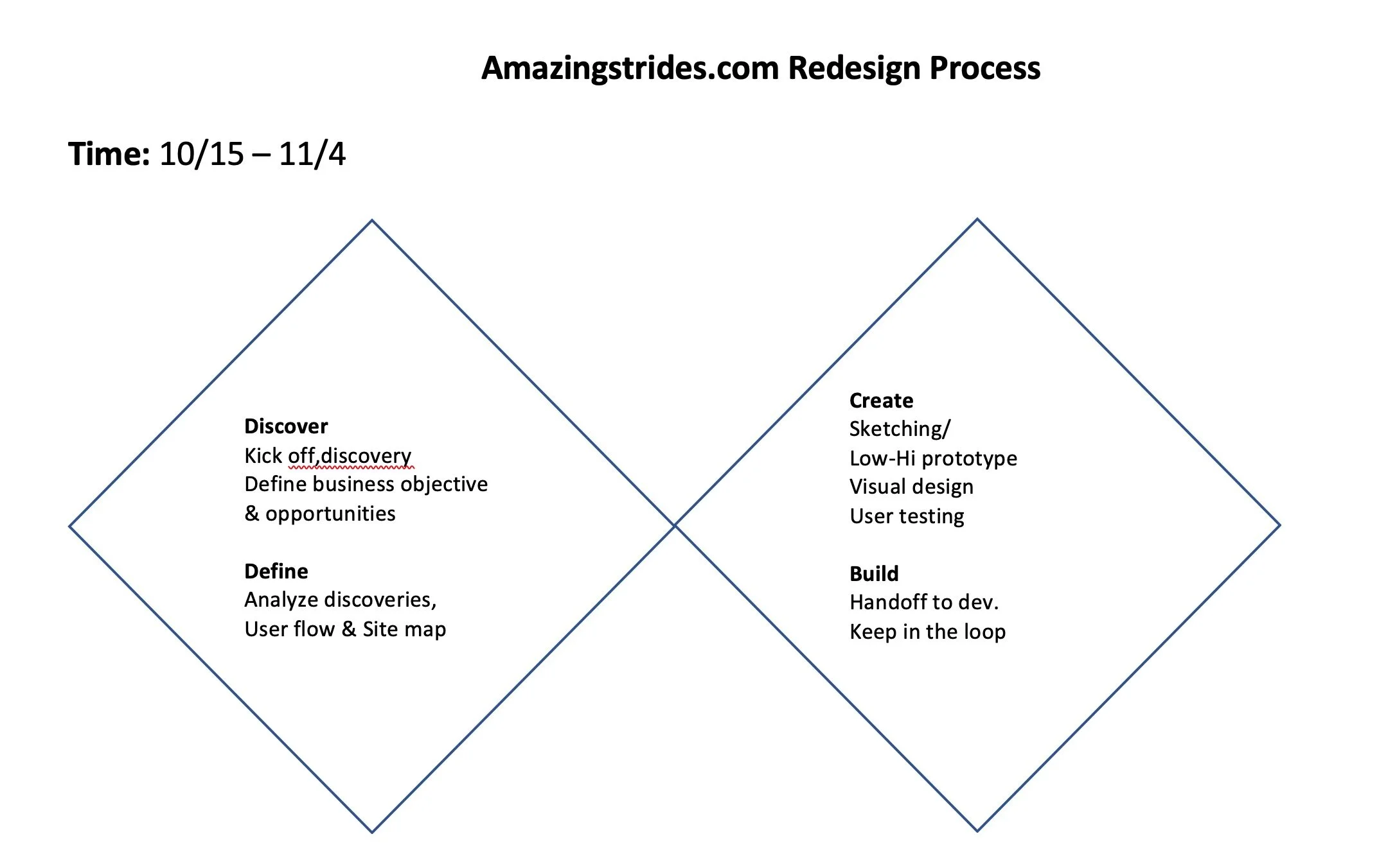
I used the double diamond method to quickly map out the process and solution we need for redesigning the website. The Double Diamond design model has four stages: Discovery, Definition, Development and Delivery.
Stage 1: Discovery
Q&A and Planning Meeting (Internally)
Since the timeline is tight, before bringing back Dominique (The CEO and Founder of Amazing Strides) to discuss the redesign process with us, I decided to review the project internally with our product team first to gather some helpful insights
Insights from product team & more:
Venessa forwarded me an initiative email she got from the product team. I put down some questions together and then during the internal meeting, we discussed and re-defined these questions that help us to understand the business objective and opportunities of Amazing Strides.
How to work as a team:
This is a side projects for all teammates. we have other priority projects on hand and I would like to know how can we communicate to make the best of it. So we discuss how do we want to collabrate for this project.
Stage 2: Define
The Define stage was composed by four parts.
Part 1 : Take what we learned from the discovery stage and look into Amazing Strides’ existing website to explore possible ways to reach the goals better.
Content Audit
Content audit is a great way to architect the information on the existing site. By building an excel sheet putting the sections from each page, it’s easy to see if there are any duplicated content, and if any content is listed on the right section.
Current UI issues
Going through each page, there are some significant issues need to fix from UI design perspective:
Inconsistency:
CTA Buttons are in different sizes and format
Some texts are left aligned, some are middle aligned
There two background colors: Black and White
Spacing is different on each section, especially around the header area
Link issues:
The links are very confusing on the website, it links to different places and don’t really make sense.
Part 2 : Competitor Research
Since Amazing Strides is a local non-profit organization located in New Jersey, with a few similar organizations out there serving in the nearby area, we decided to look at our competitors’ sites. Product team reached out to Dominique and we received some some websites from her, which helped us find some useful information and our own opportunities.
Takaways:
Local map.
They all have a map that showing the state of New Jersey and indicating where the service is located.
Resources.
Resources with different categories.
Footer contains social media & info.
They all make use of the footer area to display the social media and contact information.
Opportunities: Amazing Strides’ own story & strong female lead.
It was the winner of RISE challenge (which is the Oscar award in the field) and have been reported by local news with video proof. In the meantime, Dominique herself is a young successful female entrepreneur with inspiring story by founding this organization. And none of the competitors we have researched can beat that.
Part 3: Sitemap & Goal re-clarification
Part 4: Meeting the client to align
Putting all information together, we invited the business owner Dominique to come into the office to kick off the project. I presented our findings and get her opinions to affirm the business goals and ensure we are on the same path.
By looking at my suggested sitemaps, we drew a sitemap together on the whiteboard.
Highlights:
Dominque is amazing! We need a video!
From the conversation with her, we found more interesting and unique facts about Amazing Strides. Dominiquee is also an amazing young woman growing up being the caregiver in her household. We want her and this agency to stand out right away. So besides adding a service app & footer (likes others), we added a section on the homepage to specially introduce Dominique in the format of self video. (Ira from the content side has a video team to help.)
Contact us is not just contact us.
When we get to the “Contact us”. Dominique said that there’re 3 user groups that usually contact her organizations: agencies, volunteers and families. We decided to list these roles separately too in “Contact Us“ so that it helps users submit the contact form, while also helps Dominique and her team to sort the incoming information.
Content, content, more content.
Discussed what else we need from Dominique to support next steps: FAQ content, Testimonials, logo, service map, images (unsplash), GoDaddy password… listed them out and sent Dominique in a follow up email with a deadline.
Stage 3: Create
Round 1 mid-fidelity wireframes
Based on discussion from the meeting and sitemap, I designed 3 version of mid-fi on Sketch. By viewing with Venessa, we picked one and went through the internal meeting for approval.
Round 2 mid-fidelity wireframes
Challenge: Technical constraints
There’re always challenges along the design journey. After 1st round of mockup received approval, our develop team realized that the current platform that Amazing Strides was built on has very limited functions and we are not able to display the content as we wanted to based on 1st round of mockups. Besides template constraints, we also had issues with the counts of words. So I have to rework on the wireframes based on technical constraints. In the meantime, I sat with Ira, our content writer to go through each section.
High fidelity wireframes
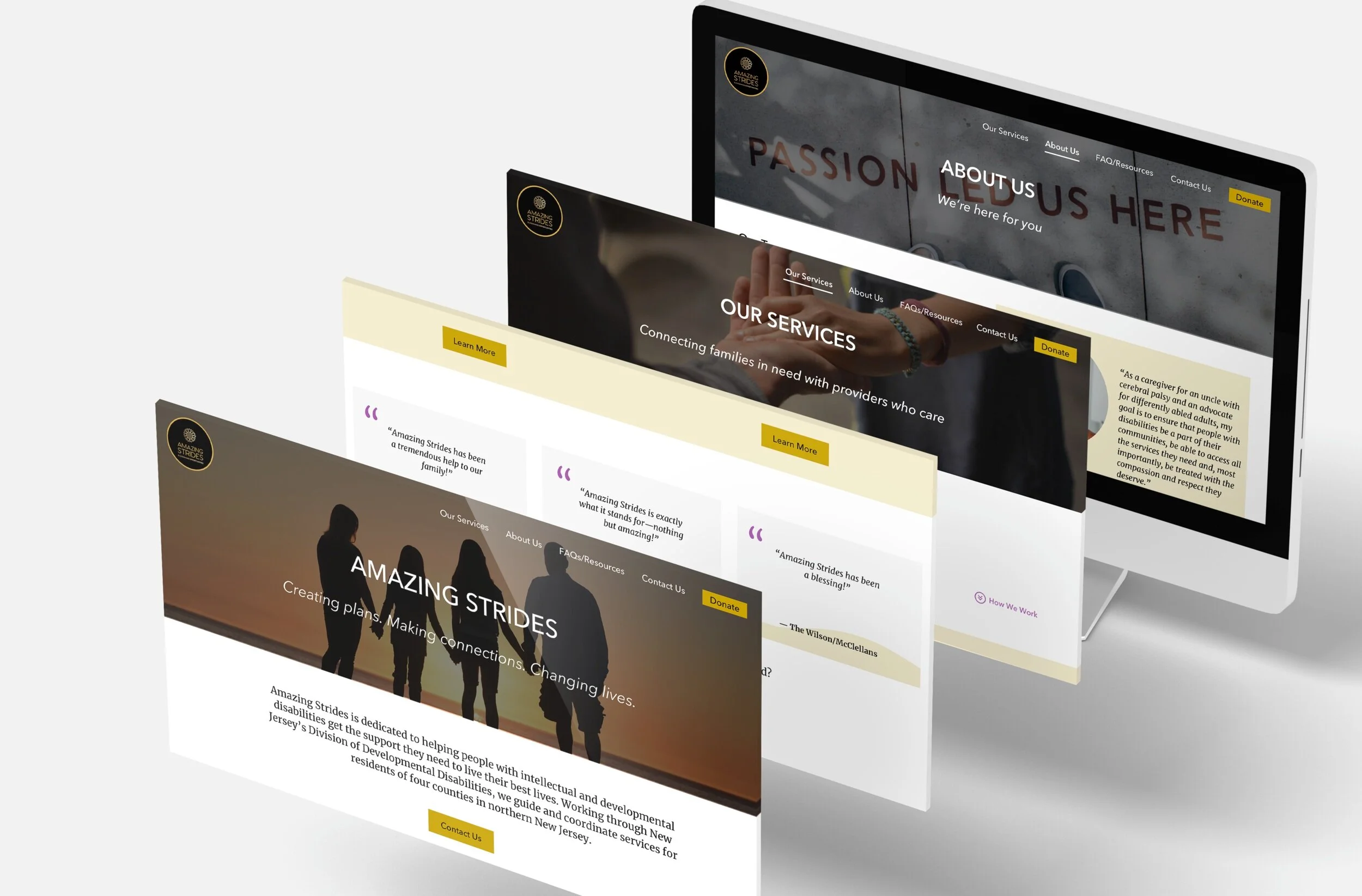
Branding & readability. We wanted to keep the website simple and easy to use. Based on the existing logo from Dominique, we decide to keep the color elements in her logo: gold and black. And then make the background white instead of black, especially when some clients are physically disabled, we need to makes sure everyone is able to read the content on the website.
Our product owner Carly helped pick some great images that reflecting the concept, so I applied all UI elements accordingly to the final wireframes.
Stage 4: Build & ADA reviews
When handoff the design to develop team we only had one week left to make it live. By playing around GoDaddy and added Wordpress elements (Jorge is a wordpress expert), we finally made it published in time.
Challenges:
Can’t solve but we tried: Since we are using a web platform service the design is not showing exactly the same as hi-fi designs. I personally also had a work session with Dylan - our developer to adjust the final spacing, fonts and all UI detail from the live website to make it as presentable as possible in all breakpoints.
Resolved: Dominique wants to know how to update the website information by herself going forward, and she has no idea how to do so. Our dev Andrea drafted a step by step guide and send to her.


