Project overview
Building Cancer Care from 0 to 1 to 2 — launching an MVP under tight constraints, then evolving it into a trusted, research-driven program.
Transcarent wanted to create a cohesive cancer care solution that would connect employees and their families with high-quality cancer care from leading experts and oncology providers. I joined after initial discovery, with early design pieces already defined, and stepped in to unify them into a seamless experience.
My focus was connecting the pieces into a cohesive patient experience: onboarding → cancer landing page & member guidance → connecting with partners → surfacing articles and resources for member support.
We had a mandate to build Cancer Care from the ground up, with limited resources.
On the brighter side, Transcarent's other in-app experiences had already been established and could be connected to build a supportive cancer care hub.
Not currently on a cancer journey — screening reminders and prevention content are most relevant.
Actively navigating treatment — need clear next steps, provider access, and emotional support.
Supporting someone else's cancer journey — need visibility into care plans and how to help.
Beyond active treatment — need ongoing monitoring, resources, and long-term care guidance.
"Cancer is a scary word. I don't want to see information about Cancer Care if I don't have cancer."— from user research
How do we create a viable, personalized experience with limited resources — and set the foundation to grow later?
MVP business requirements centered on using Transcarent's Health Guide as the main point of contact for personalized support, and leaning on partner resources (Access Hope & HealthWise) to activate the cancer care benefit. I collaborated with Clinical, Care Support Service, and Product to map jobs, solutions, tools, and content needed per persona and scenario — and worked with other experience teams to feature existing Transcarent experiences as the right next step, so the whole thing felt cohesive.
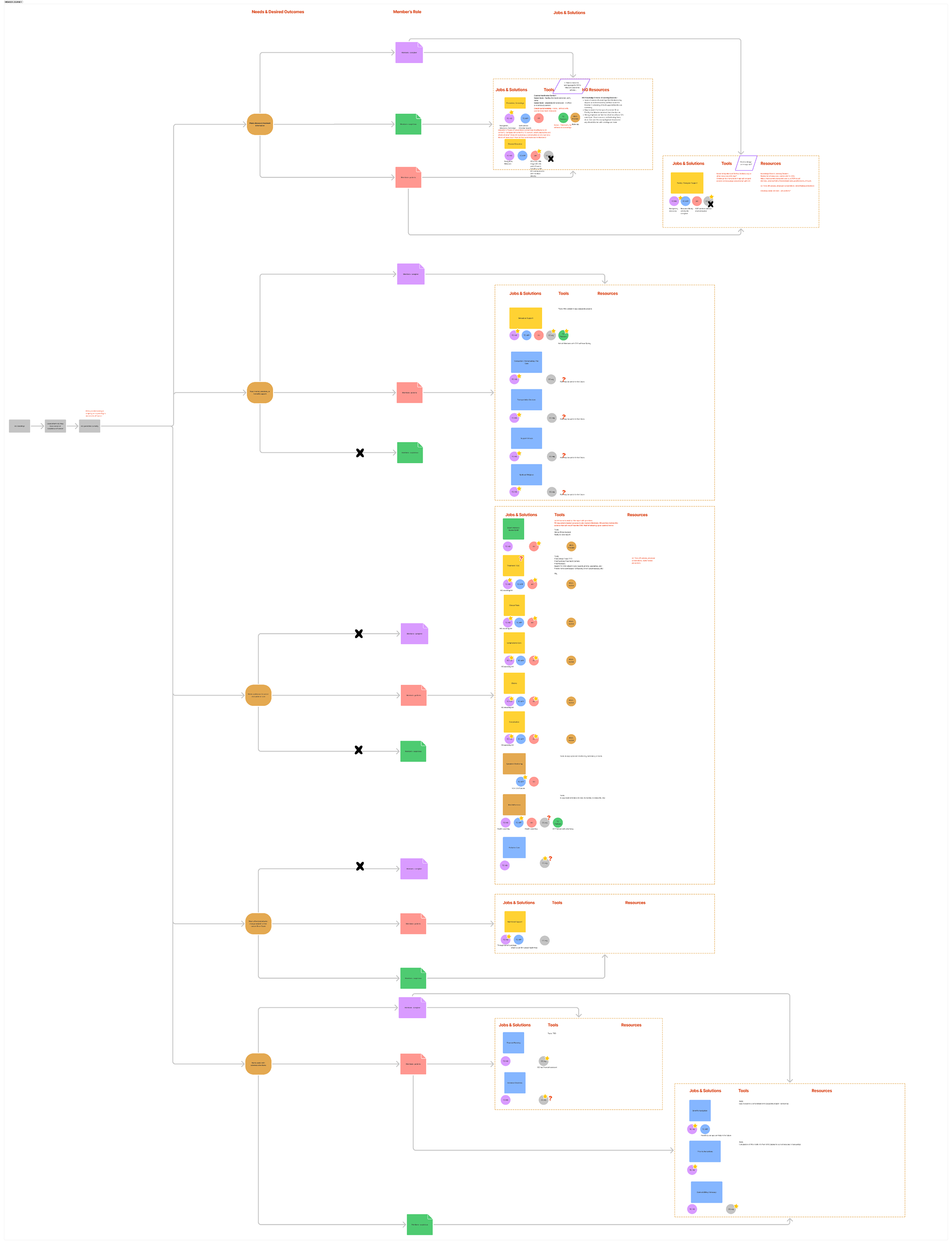
Problem: how do we make sure the Cancer Care experience serves the right audience?
Outcome: a quick, simple questionnaire that identifies a member's cancer journey stage upfront, so the right next step can be personalized within the Cancer Care space.
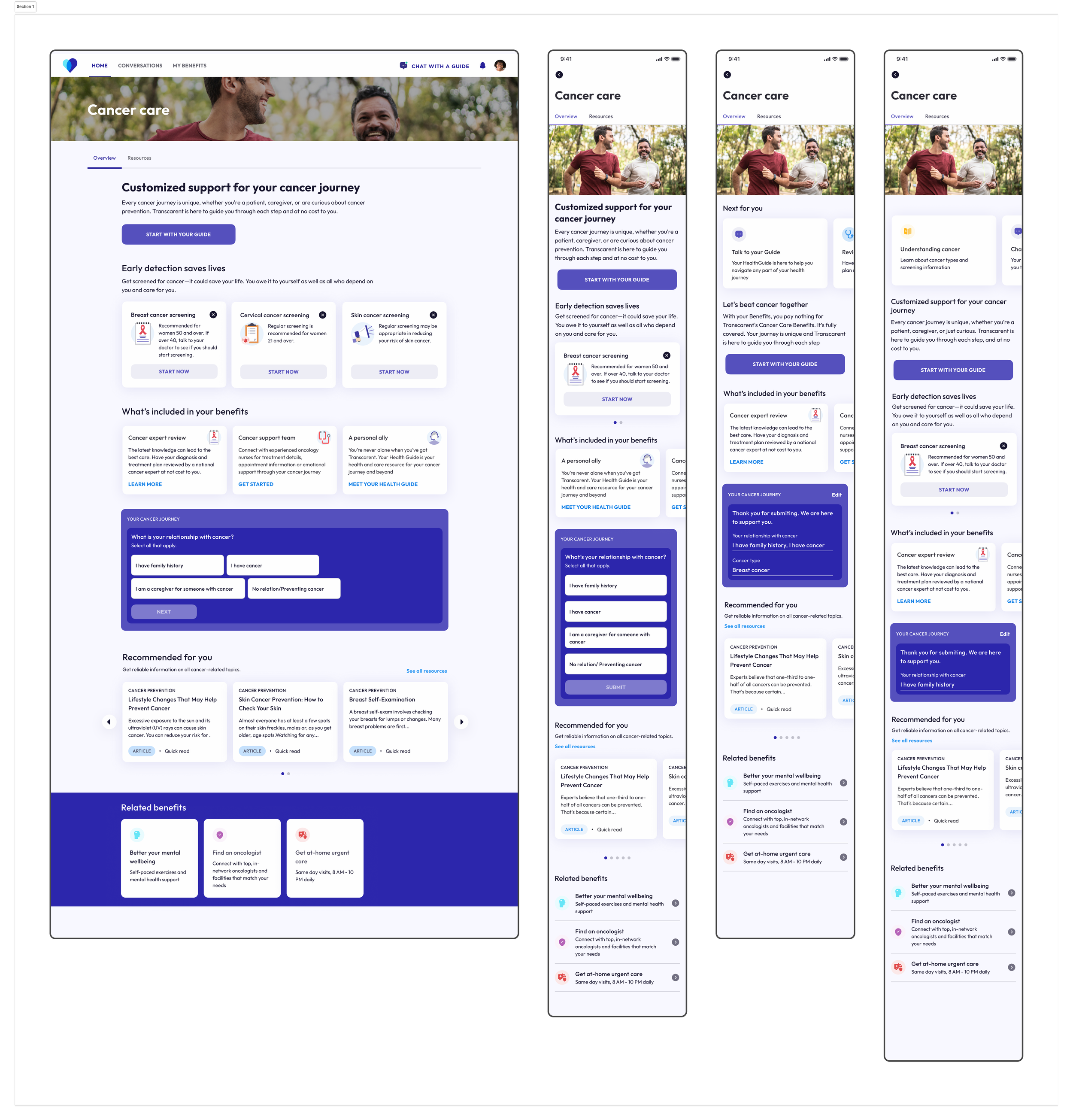
Problem: members need a simple, trustworthy entry point to understand and access cancer care benefits across prevention, screening, and treatment.
Outcome: a modular landing page that helps members understand the Cancer Care benefit and encourages completion of the questionnaire for personalized support.
Problem: people struggle to know where to go for cancer screenings, and different cancer types require different screenings.
Outcome: an MVP reminder flow for the cancer-prevention persona, guiding members to schedule screenings with the right provider, aligned with USPSTF guidelines.
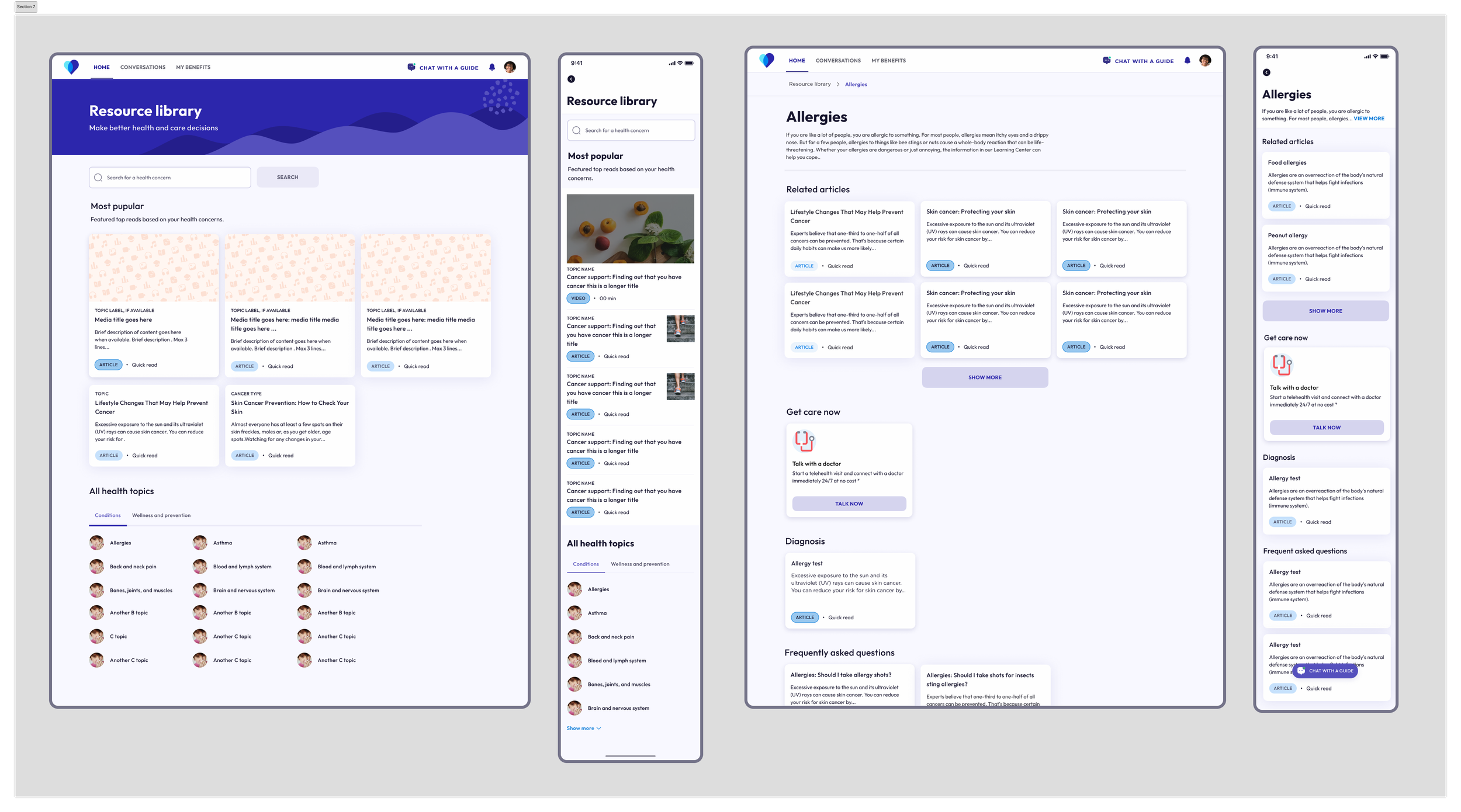
Goal: with API support from Healthwise, design a cancer-focused resource library delivering personalized, clinically relevant content aligned to member personas.
Goal: give cancer patients quick, clear access to partner AccessHope's expert second-opinion service.
Cancer Care expanded into a standalone offering with more clients, varied configuration needs, and new clinical capabilities such as Oncology Nurse Navigators and a Cancer Center-of-Excellence network. The original MVP couldn't support this growing complexity — key touchpoints were fragmented, making it hard for members to know where to start.
create a cohesive, scalable end-to-end Cancer Care experience integrating new clinical and partner services across all client implementations.
I led a heuristic evaluation to identify core usability failures — navigation structure, cognitive load, and ambiguous CTAs — organized insights by persona to clarify what was mission-critical for V2, and partnered with PM/Solutions to align on scope for a phased roadmap.
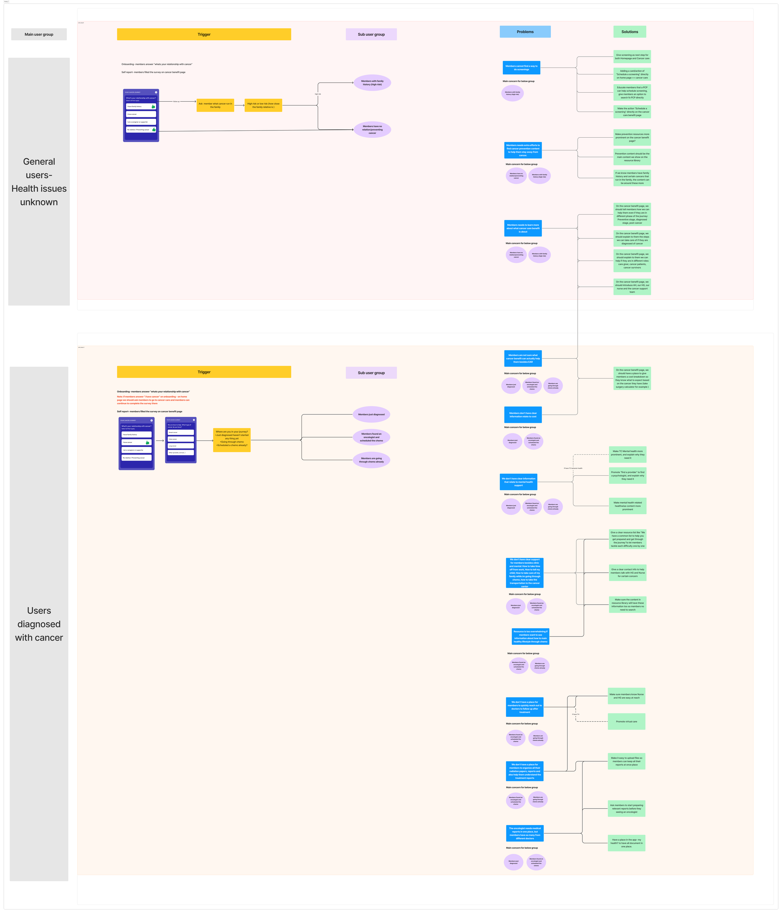
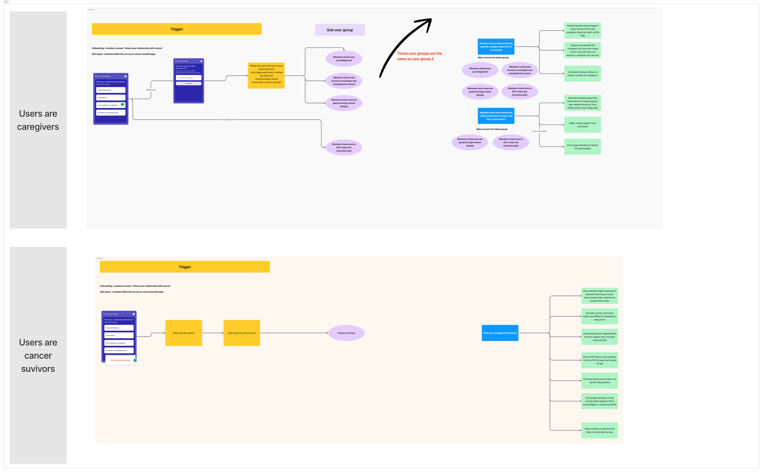
Problem: after registration, members lacked clarity on next steps, cancer care availability, and the Health Guide's role — and the onboarding questionnaire wasn't personalized enough.
Outcome: improved onboarding depth and relevance by designing questions aligned to client configurations and new resource capabilities, coordinated with Growth PM and other designers to fit the broader app ecosystem.
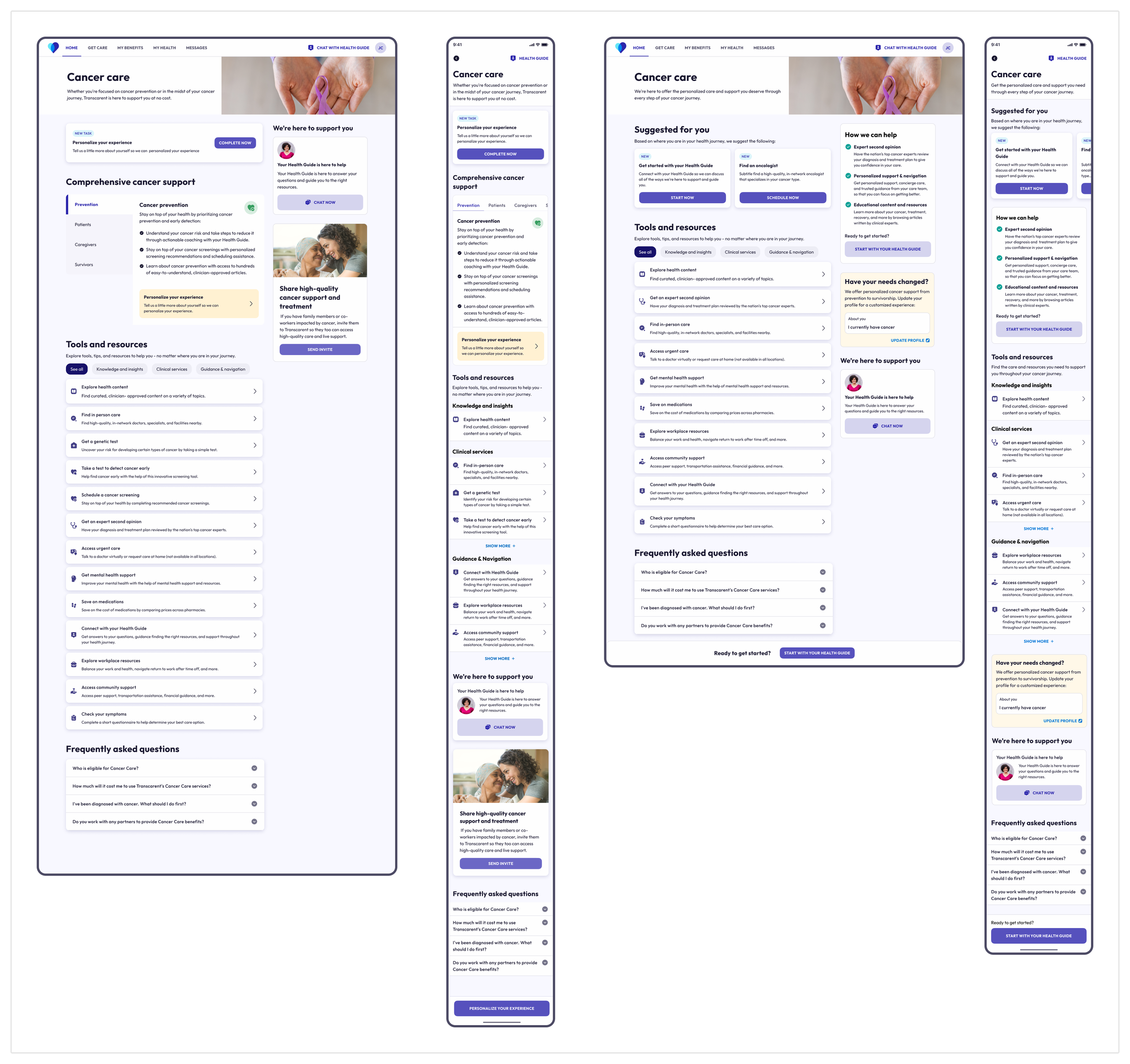
Problem: the experience lacked clear communication of oncology benefits, intuitive navigation, and empathetic guidance.
Outcome: a scalable "single view" bringing fragmented cancer resources into one place — tested with four personas, making it faster to find the right care. See case study on Figma →
Problem: members needed simple, timely guidance and low-friction pathways to understand, schedule, and complete recommended screenings.
Outcome: evolved from an awareness-focused V1 to an action-oriented V2 — members can track screening status, receive due-date reminders, and schedule missing screenings.
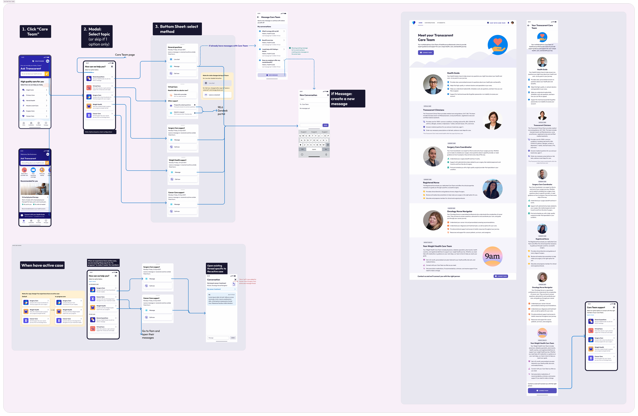
Problem: as the care team grew, members struggled to understand who to message and who was supporting them.
Outcome: a service framework connecting members with specialized care team members. See case study on Figma →
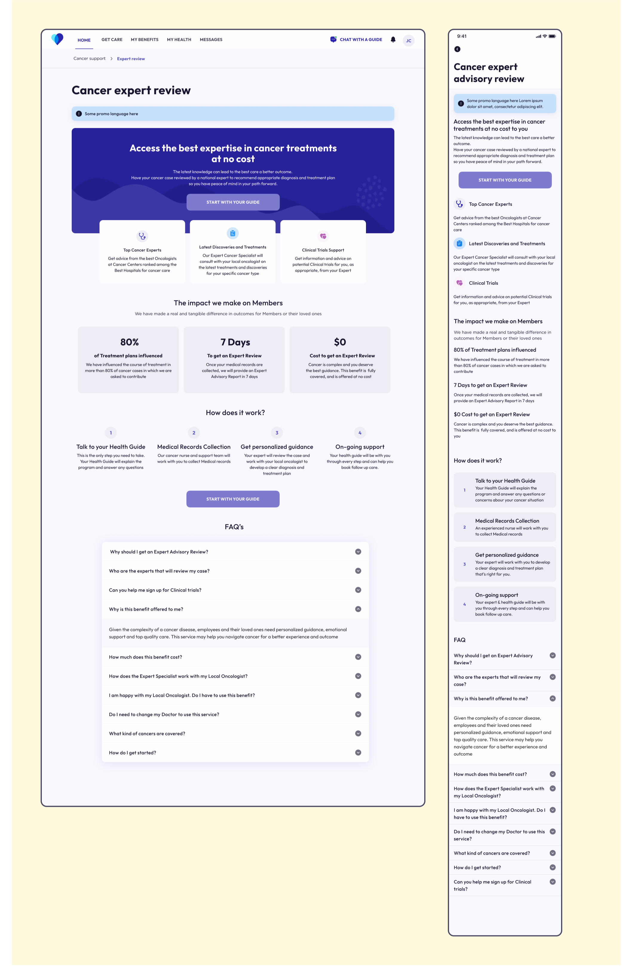
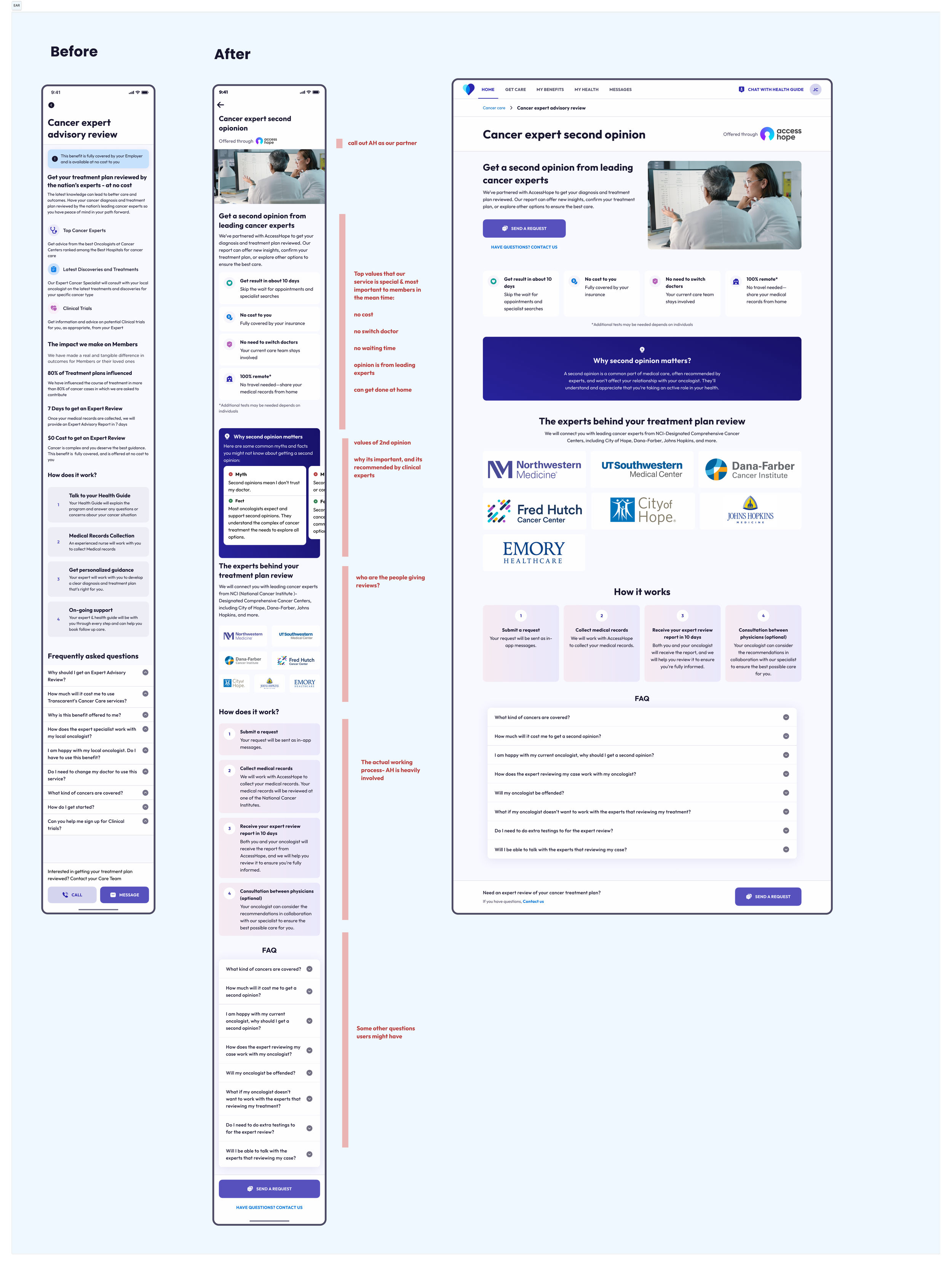
Problem: users weren't sufficiently aware of the expert second-opinion service, resulting in low conversion.
Outcome: redesigned the page to clarify the value of an expert second opinion and strengthen content and CTAs — projected 2025 impact of 27 expert reviews and $167K in cost avoidance.
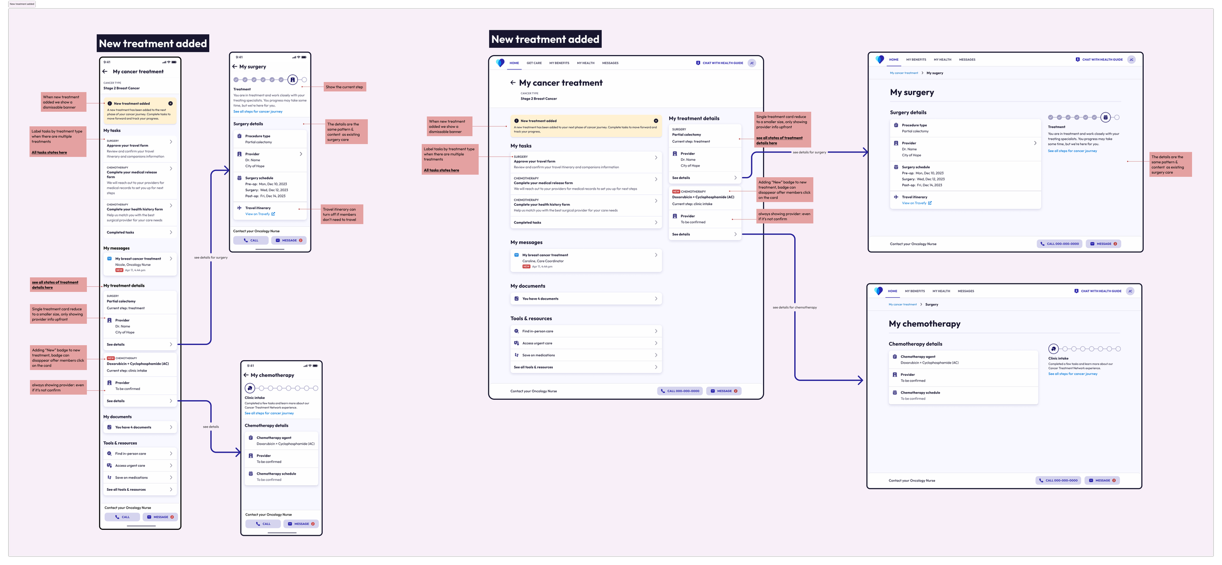
Phase 1 problem: patients could only progress in their care journey through phone-based support and manual PDF health intake via email.
Phase 1 outcome: set up a treatment workflow foundation — the main Cancer Center-of-Excellence landing page as a primary entry point, and two core intake forms translated into an in-app experience.
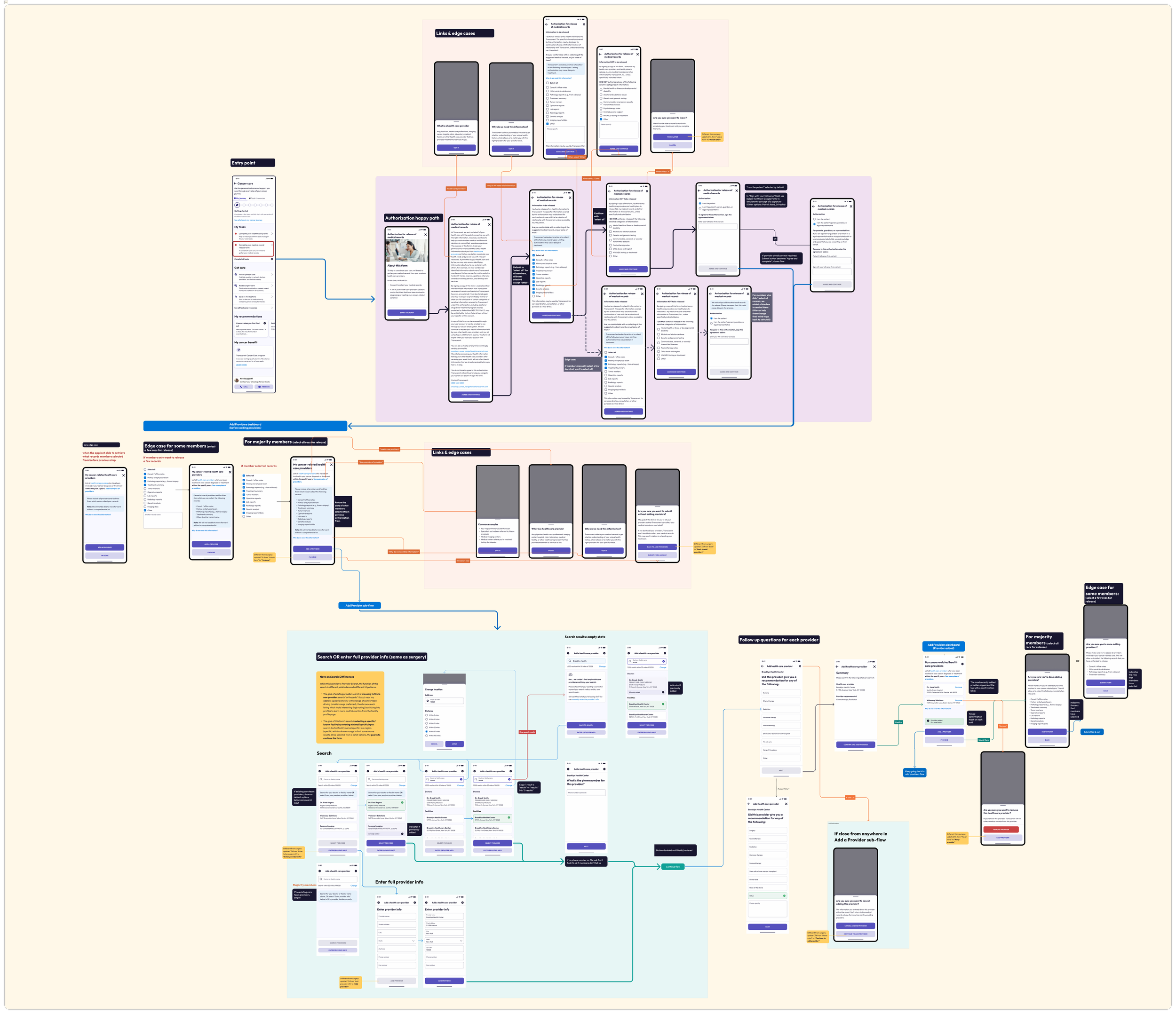
Phase 2 problem: there was no tracking capability on the app for active cancer cases.
Outcome: a dashboard allowing members to track treatment progress and tasks, all in the app.